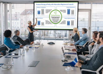
What are a couple simple things people can do themselves to make their PowerPoints look better?
Making a professional PowerPoint presentation shouldn’t be rocket science. Alan, a partner at eSlide, shares three tips anyone can implement to quickly level-up their presentation skills. These candid suggestions should improve the aesthetics and effectiveness of your slides in any business setting.
First, Alan stresses the importance of time management. Allocating sufficient time to design your presentation can prevent the common pitfalls of last-minute, hurried work. You must be able to consider each element carefully, from content organization to visual design.
Secondly, starting with a professional template is key. Using your organization’s branded template ensures consistency in colors and logos, and gives you model slides to start from. This simple step helps you to work more quickly, with less effort, and gives your slides a professional polished look.
Lastly, being intentional about the use of color can impact the clarity and focus of your presentation. Alan suggests using bright colors for key takeaways and more muted tones for background or secondary information. This strategy helps important points pop and capture your audience’s attention where it matters.
For more detail applying these tips, watch Alan’s full discussion in our latest video. His intel will provide you with the tools to transform your PowerPoint slides from basic to professional with minimal effort.
By adopting these simple yet effective strategies, you can enhance your ability to communicate clearly and professionally through your presentations. Whether you’re presenting to peers, executives, or external stakeholders, these tips from eSlide will ensure your presentation is both impactful and memorable.


