How to Make Your Business PowerPoint Presentation Font-tastic
If you’re a regular reader of this blog, you’ll know we’re always talking about the importance of visuals. A big part of your total visual package in your business PowerPoint presentation is the font you choose. It’s more important than you think.
Steve Jobs learned this when he sat in on a calligraphy class in college. The subject fed his inspiration for the Mac. In his 2005 commencement address at Stanford, Jobs said, “It was the first computer with beautiful typography. If I had never dropped in on that single course in college, the Mac would have never had multiple typefaces or proportionally spaced fonts.”
People have been designing and studying typefaces for centuries, so there’s a lot to say on the subject. But first we want to impart some design trivia: ‘Typeface’ is the word you use when you’re talking about letters. ‘Font’ is the word you use when you’re talking about a specific size and style of a typeface. For example, if Garamond is the typeface; Garamond, 13pt, bold is the font. Feel free to use that bit of design trivia to wow your friends at your next dinner party.
To avoid confusion here, we’ll stick with ‘font’. Here’s more handy information about fonts and how to choose and use the best in your next business PowerPoint presentation – all from your design experts at eSlide.
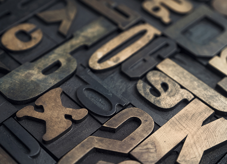
Serif vs. sans serif
Serif vs. sans serif is the first decision designers make when choosing fonts.
Serif fonts are the ones that have the little tails or lines on the ends of each letter, e.g., Times Roman. You’ll see these most commonly used in printed newspapers or in books. (Yes, these things do still exist.)
Serif fonts are used for printed text because the tails (or ligatures) lead your eye from one letter to the next which is less tiring to the eyes when reading large blocks of text. Importantly, serif fonts are more difficult to read when projected which doesn’t make them a good choice for presentations.
Sans serif fonts don’t have the ligatures on the ends of the letters, e.g., Arial. These are used more for headlines, taglines, and bits of info that need to capture the eye’s attention. That’s why sans serif fonts are the best choice for business PowerPoint presentations.
A third type of font – known as scripts – are those that emulate handwriting. These can be especially difficult to read in a presentation, so save the scripts for your wedding announcement or party invitation.
Finally, there are decorative fonts and dingbats. Decorative fonts have the same problem as scripts in that they are hard to read so should be used sparingly and kept out of presentations altogether. Dingbats are symbols rather than letters and are generally used exclusively as bullet characters.
Font of personality
Every font has its own unique personality and helps to shape the tone or overall feeling of your business PowerPoint presentation.
A lot of fonts look a lot alike. Yet, small differences – often imperceptible to an untrained eye – can make a big difference in the feelings they evoke.
To help you decide which font to use, try this quick exercise. Pick a word that best reflects what your presentation is about. For example, let’s try ‘excitement’. Compare ‘excitement’ in a handful of different fonts right next to each other. This trick will help you quickly see which font conveys ‘excitement’ best. That’s the one you want.
Don’t dis PowerPoint’s fonts
PowerPoint comes fully loaded with lots of great fonts. Try to stick with what’s there, rather than importing something fancy from left field. Using non-standard fonts will likely cause compatibility problems when sharing presentations among colleagues, clients or using presentation equipment at conferences. For a list of system-safe fonts, read this.
Your company may have a corporate PowerPoint template. Font choices will be part of this. Hopefully, they’ve consulted a professional design team to create the template, so you can be confident that the fonts are appropriate and effective for your purposes. All you need to do is follow what’s there. Phew, problem solved for you.
Font-tastic ideas
Try as much as possible to stick to one font throughout your business PowerPoint presentation. Mixing multiple fonts may seem like a good way to add visual interest, but there are better ways to accomplish this. Varying font size and font effects is a good way to make things look interesting while maintaining readability.
Effects like bold, italic or changing font colors give you options for getting creative. You can also work with spacing and capitalization to add visual variation. As always, remember that overdoing any effect may diminish your presentation’s impact by making it look cluttered or confusing.
Less is always more when it comes to design. And if you feel confused by all the options and aren’t sure what to do…here’s what to do…
Now for the font stuff
If you’re thinking, “oh no, another thing to remember for my business PowerPoint presentation,” then you’ve come to the right place. At eSlide, we’ve been assisting some of the biggest companies in the world deliver amazing presentations for the past 20+ years. Give us a call to discuss your next PowerPoint presentation and let us take your font and design worries away.