A Single Slide to Summarize Political Stonewalling
Bill McInturff, a partner at Public Opinion Strategies, created a single slide that’s making waves in and out of the belt-way.
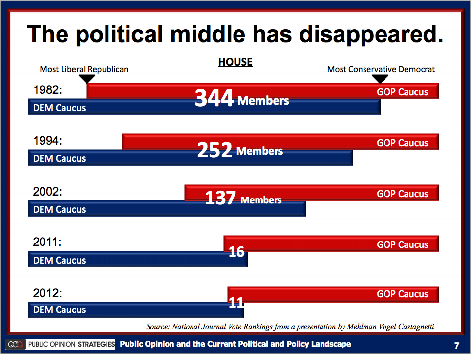
Interesting choices to note:
- The constructions, colors and symbols are familiar. The data is what pops.
- The audience sees what the presenter sees. This number of “middle” members is shrinking.
- We don’t see the information we don’t need. We don’t need to see the Senate numbers, we don’t need to see the breakdown numbers, or the total (which is 435). We just need one: the size of the “political middle” in chronological order.
- The slide answers all the relevant questions. The bar graph measurements, the key anchor points, and the source of the data is right there.
- McInturff didn’t need to use the data from every year to make his point. In fact, the years: 1982, 1994, 2002, 2011, and 2012 aren’t even close to equal spacing.
Key Takeaways
McInturff makes a simple, bold claim, and provides the evidence. PowerPoint is powerful because it delivers the visuals that support a presenters claim. Show, don’t tell. Explain your data aloud, and avoid weighing down your slides with a bunch of copy. Lastly, make an impression. Make an unforgettable point like this slide, and it will stick with your audience.
Special thanks to The Washington Post and Chris Cillizza for bringing this slide to our attention.