Speaker of the House Not Speaking?
For the past few weeks here in the U.S., the hot topic in the news has been the Debt Ceiling stalemate. Both sides of the discussion, as well as the media, have emphasized the importance of getting the situation resolved to avoid our nation’s first-ever financial default.
Sunday night, President Obama told reporters at the White House that “the leaders of both parties in both chambers have reached an agreement that will reduce the deficit and avoid a default.” While at that time House Speaker John Boehner was holding a conference call with Republican House members.
Before speaking publicly, Boehner’s pitch to his caucus was available online. This was found in The New York Times blog, The Caucus: http://www.speaker.gov/UploadedFiles/3-7-31-11-Debt-Framework-Boehner.pdf
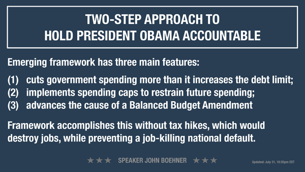
I would think that a topic as critical as this would be deserving of a better effort in presenting the information. Looking at content of the first slide, it leaves me to wonder what are Steps 1 & 2 of the “TWO-STEP APPROACH”? It seems the titles were developed as sound bites and the content is not always in support of those statements. As slide professionals we look for ways to visually clarify content – so that the slides help illuminate the presenter’s thoughts, ideas and plans.
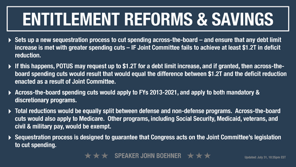
Although slide design was probably not the most important consideration, a good amount of the basics of presentations were overlooked in this document. Title Case is easier to read than the All Caps used on these slides. As if that wasn’t enough emphasis on the title, they put a rectangle around it, and it is considerably larger than the rest of the content. The same effect may have been achieved by making it slightly larger than the content, making it Title Case and differentiating with color. That would have left more room for the content.
There is little consistency from slide-to-slide. Type size, bullet treatment, and text positioning varies throughout the file. It seems as though the approach was “whatever it takes to fit the content.”
Again, I know this critique is less important than the subject matter, but I can’t help myself when I see “rookie” mistakes on a high profile presentation. Maybe the Speaker’s staff could benefit from a quick review of our S.E.E. Presentation Design series.


