Delightful Data Labels
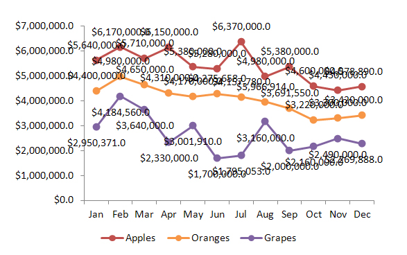
You’ve sorted your data, created your chart, and then added your data labels, but jeepers,
what a mess!

Instead of an informative illustration you have something that looks overwhelming and impossible to read. If only you could display the data in $ millions.
At eSlide we see this situation often, and like most things in PowerPoint there are many ways to approach it… some are helpful while others lead to problems. In this post we’ll give you some simple solutions that will keep your chart working as it should, and looking like you want.
First the BAD… It is possible to click into the individual data labels and manually retype each, but this will prevent the labels from updating with changes to your chart’s data sheet in the future. Luckily, there’s a correct way to get the data to be more legible.
In this example, the fix is a quick one. Select the vertical (value) axis, then RIGHT-CLICK and choose FORMAT AXIS. In this dialog choose AXIS OPTIONS in the left column.
In the middle of this dialog is a pull-down called DISPLAY UNITS. Simply select MILLIONS in that pull-down and hit CLOSE.
Viola! The axis and all of the data labels in the chart have become easier to read.
Aha, you say, that’s great for charts with an axis but what about Pie Charts? (cue scary music).. Since there is no axis, there is no “display units” function to be found. Never fear! Even in charts like these there’s a solution.
First, select the data labels then RIGHT-CLICK and choose FORMAT DATA LABELS. Click on the NUMBER option. In the middle is a FORMAT CODE box. Type in the following: $#,##0.0,,
The commas at the end represent the display units – so one comma would display in thousands, 3 would display in billions, etc. After typing in the format code box, click the ADD button, hit CLOSE and you’re done.If you want an M, indicating Millions, to appear at the end of the labels, enter this in the FORMAT CODE box: $#,##0.0,,”M”. Anything in the quotes will display as text after your data.
The best part is that if your data changes, the numbers will update, formatting included!
For more tips like this, check back on our blog frequently, or subscribe to the eSlide newsletter
“To The Point”.


