Common Mistakes for PowerPoint Presentations
A Powerpoint presentation can make or break your pitch. Make sure your slides are up-to-snuff so you don’t send your audience running for the doors.
Avoid these common pitfalls, and be confident in your presentation.
1. You don’t know your topic.
No one wants to see a bobble-head presentation where you’re constantly having to look at your notecards. Or reading the slides word-for-word. Confidence is key. Be able to talk casually about your topic as though you and your best friend are discussing it over dinner. Rehearsing in front of trusted colleagues or staff members (even in a virtual setting try WEBEX or JOIN.ME) to help familiarize yourself with the content.

2. Too many or too few images.
Too many images can be overwhelming to your audience, not to mention distract from your message, while too few images can lead to miscommunication and overall loss of attention among your audience. The right balance of pictures or graphs can be more effective than words alone. There are studies that show how much retention/ understanding improves via good visuals. *Read more here.

3. Bad ClipArt
Not only is poor ClipArt distracting, it also makes your presentation look less put-together, (like you didn’t care to take the time to find or use quality images). Your presentation is a reflection of your dedication and effort, so make sure it shows.


4. Too much / Not enough Text
Having too much text won’t benefit anyone. You’ll bore your readers to tears and chances are they won’t even be able to finish reading it before you’re on to the next slide. Make sure you have enough key points so you don’t skim over important topics.


5. Bad choice of Fonts or Color
The whole point of your presentation is to make sure your message is as clear and precise as possible. One big oversight is using typeface that is impossible to read or colors that render your message practically invisible. Stick to Sans-Serif type and opt for neutral/ light-colored backgrounds with a dark font. Also, avoid neons and yellows.
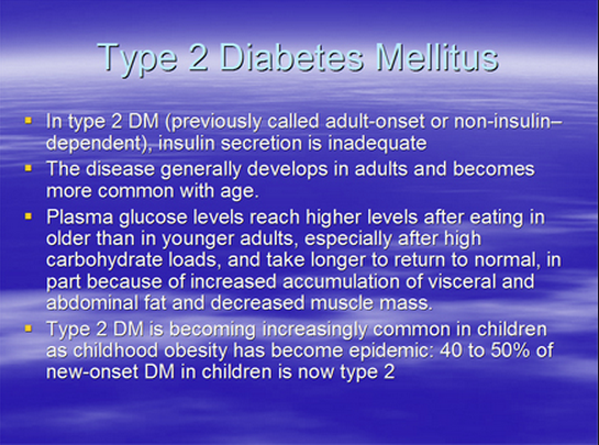

Bad Use of Color Sans Serif Font