Why Your Business PowerPoint Presentation Needs White Space
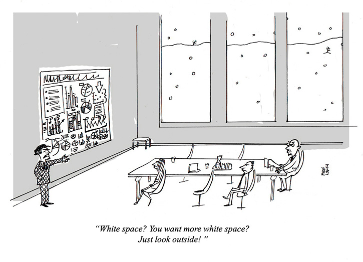
The US has had a tough winter, especially in the North East. Many cities are buried under mounds of snow and frankly, are running out of places to put the piles of white stuff.
The designers at eSlide have an idea – it should go into your slides. Of course we don’t mean snow…we mean white space in your business PowerPoint presentation.
White space is the empty (or negative) space on your slides. It doesn’t really have to be white, but it does have to be there. In fact, it’s an integral component of any presentation design, guiding the viewer’s gaze and their attention as the story unfolds.
Rather than being considered “the unused part” of a slide, white space should be an intentional addition, helping you to emphasize the points you want to make.
Defining White Space
White space includes any empty space on your slides, i.e., above, below, around and in between elements. These spaces can be split into two groups: active and passive.
Examples of passive white space include margins or the spaces in between lines of text. This space occurs naturally and simply helps to prevent information overload. Active white space occurs intentionally, and is used as a design element to create distinction and hierarchy between elements, drawing attention to what’s important.
One-Topic-Per-Slide
It’s easy to default to putting everything you want to say and show on every slide, resulting in a crowded and often confusing business PowerPoint presentation. Resist the temptation.
It’s best if you stick to the one-topic-per-slide rule. That doesn’t mean just one point or chart per page…of course your slides need to contain sufficient points to be meaningful. But overcrowding your slides with multiple topics will mean less white space and therefore less clarity. Cognitive Load Theory shows that it is better to have more slides with good white space than fewer, denser slides. See a great summary article here.
It’s important to evaluate every item you want to include on each slide. Ask yourself: does adding this make my slide more effective? If the answer is ‘no’ or even ‘maybe’ – get rid of it.
An Air of Authority
White space will give you and your presentations an air of authority. Think of the one-image-no-text slide formula that Steve Jobs was famous for. Those slides reinforced his image of being the smartest man in the room because he wasn’t afraid to keep his words off the slides and trust himself to tell his audience what he wanted them to know.
In this article, “11 Presentation Lessons You Can Still Learn From Steve Jobs”, author and Forbes Columnist Carmine Gallo notes, “In the first three minutes of Steve Jobs’ famous iPhone presentation, he uses a grand total of 19 words (21 if you include dates). Those words are also distributed across about 12 slides.”
Don’t be afraid to use white space as Jobs did. If he had filled his slides with lists of iPhone features, his audience would have been reading rather than listening. When you are giving your business PowerPoint presentation, you are the authority in the room. White space is not wasted space; its space that’s helping you speak with authority. So don’t waste your moment reading from slides that are littered with lists of bullet points.
Help Is at Hand
White space shouldn’t be an afterthought in your business PowerPoint presentation. Instead, make it an important and considered design element right from the start.
If you’re interested in reading more about white space, check out The Elements of Graphic Design: Space, Unity, Page Architecture, and Type by Alexander W. White. In it, the author quotes an anonymous source who sums up the importance of white space, “Design is not the abundance of simplicity. It is the absence of complexity.”
Learn more by joining one of our design training courses. eSlide’s one-hour S.E.E. Design Training shows you how to use white space and other key design elements to help you create memorable business PowerPoint presentations.