Before
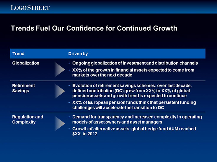
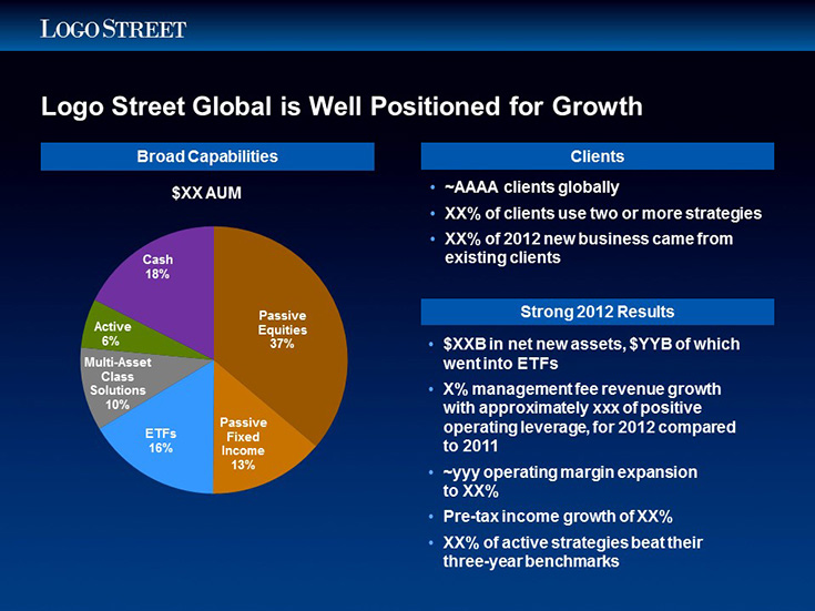
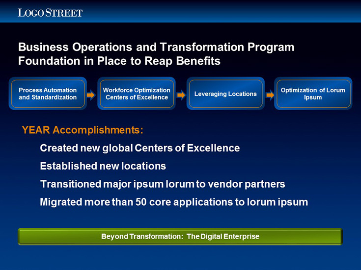
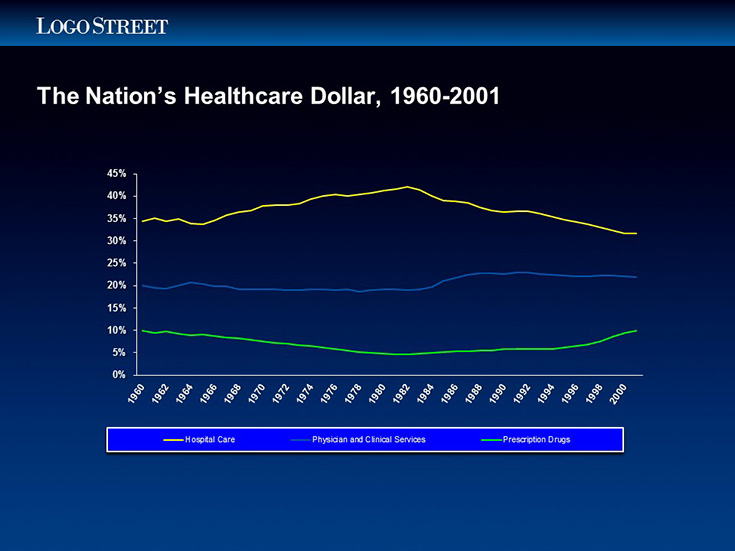
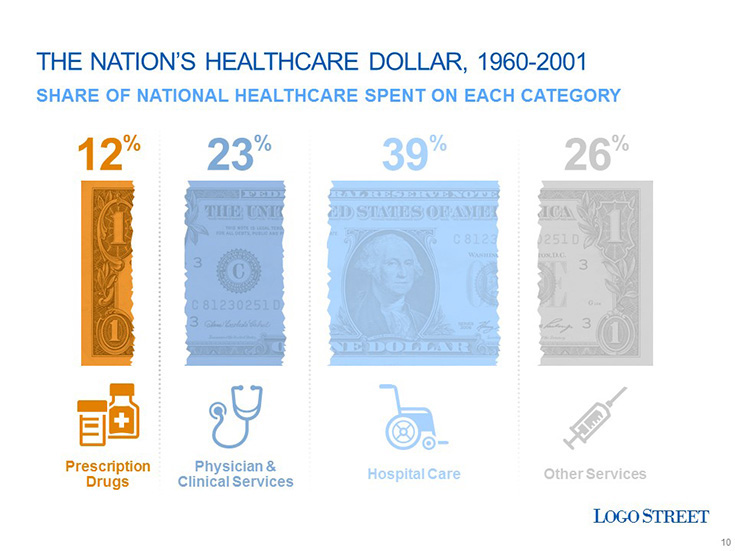
The old template was using a dark background and therefore was rather dated looking. This also made their slide decks hard to print or reuse in other applications. Also, the background color was forcing them to use bright primary colors for their information, which gave their presentations an unsophisticated look. Their investment strategies were cutting-edge, but their slides were making them look behind the times.
After
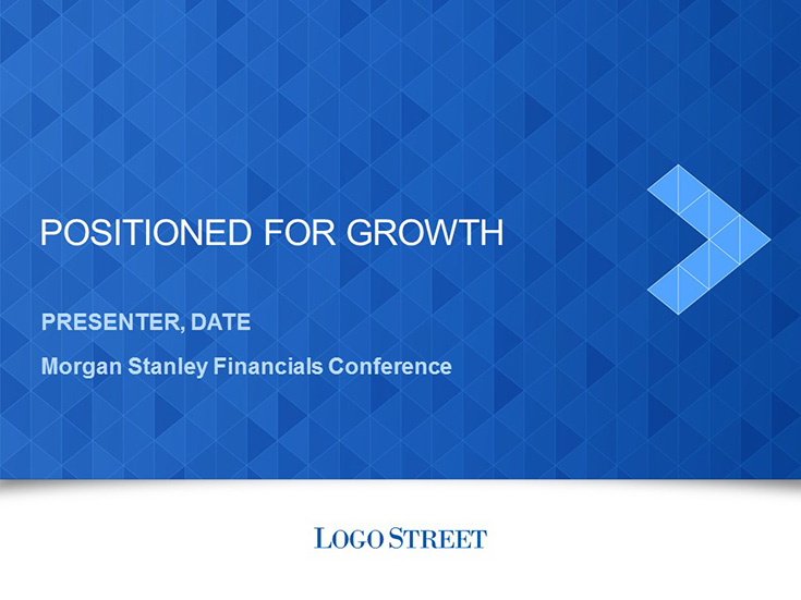
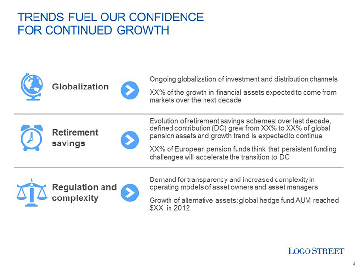
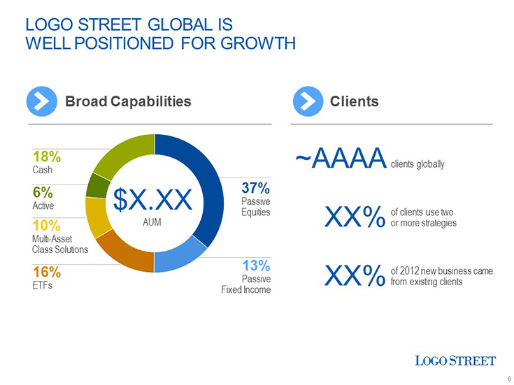
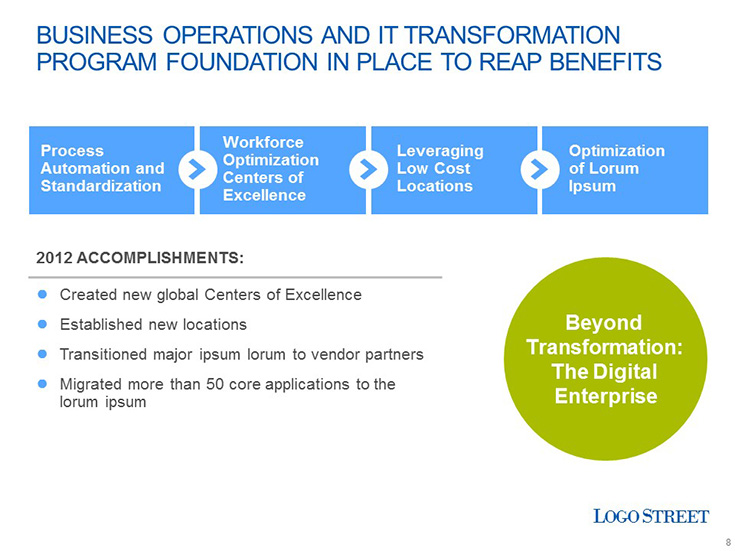
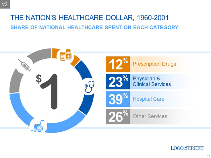
eSlide guided the C-level decision team towards a clean, stylish design template that was easy for authors to use. We created a template system that allowed easy conversion from standard format (4×3 aspect ratio) to widescreen format (16×9 aspect ratio). Once the template was approved, we worked with authors directly to help visualize their important content using infographic styles
Results
After engaging eSlide, the client was able to trust our expertise and optimized development process to keep their project focused and moving forward. By facilitating group reviews we were able to smoothly get consensus on design styles so we could begin redesigning important content. This created a robust set of sample slides which authors were able to reuse and update for future presentations. Suddenly the clients were in a much better position to respond quickly to shareholder requests for information – and the look of the presentations did justice to the market intelligence behind the strategies.

